For one illustration, this piece really had quite a few reasons to be created. I worked on this piece in early 2017, and at the time I had quite freshly finished a rooster commission for Chef Michael Smith. He purchased the rights to the piece, and the rights to reproduce. This rooster was truly no longer mine!
You may recall, 2017 was the year of the rooster! I was living in Vancouver, and with the huge Chinese population and culture there, I was seeing them everywhere. Admittedly, I started feeling like I just wanted one to keep for myself. Everyone was showing their rooster art and mine was gone. It may be kind of odd, but it is what it is. One rooster was out into the world, and I wanted another.
The third reason to create the piece- Was once again my grandmother Elsie. She was an avid rooster collector, to the point where she eventually said “Okay thats enough, no more roosters really” to us all. We may have stopped buying her all things rooster, but her home and especially her kitchen are very much ingrained in my memory.
So… A rooster to call my own, in the year of the rooster, as a way to remember my grandmother- That about sums it up.
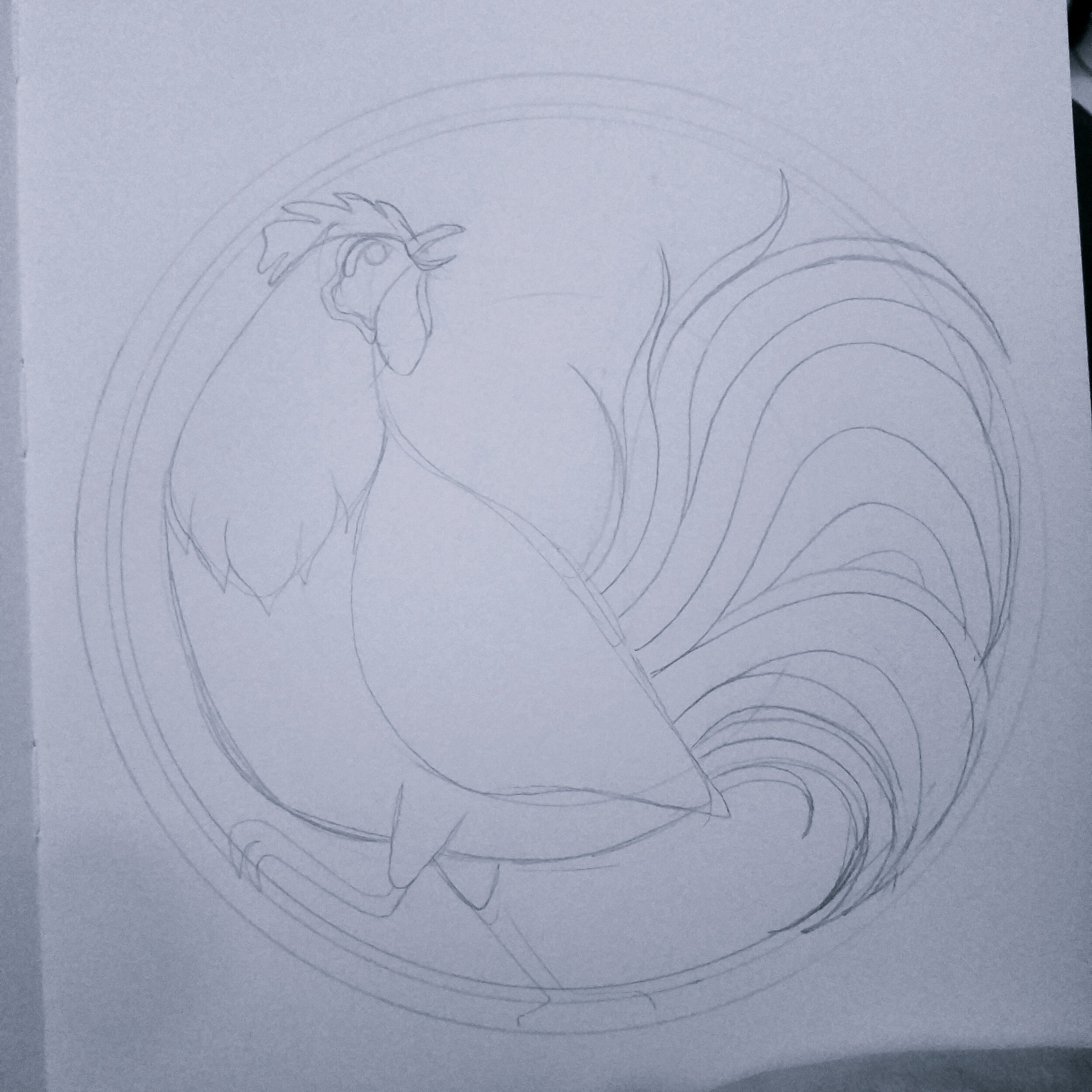
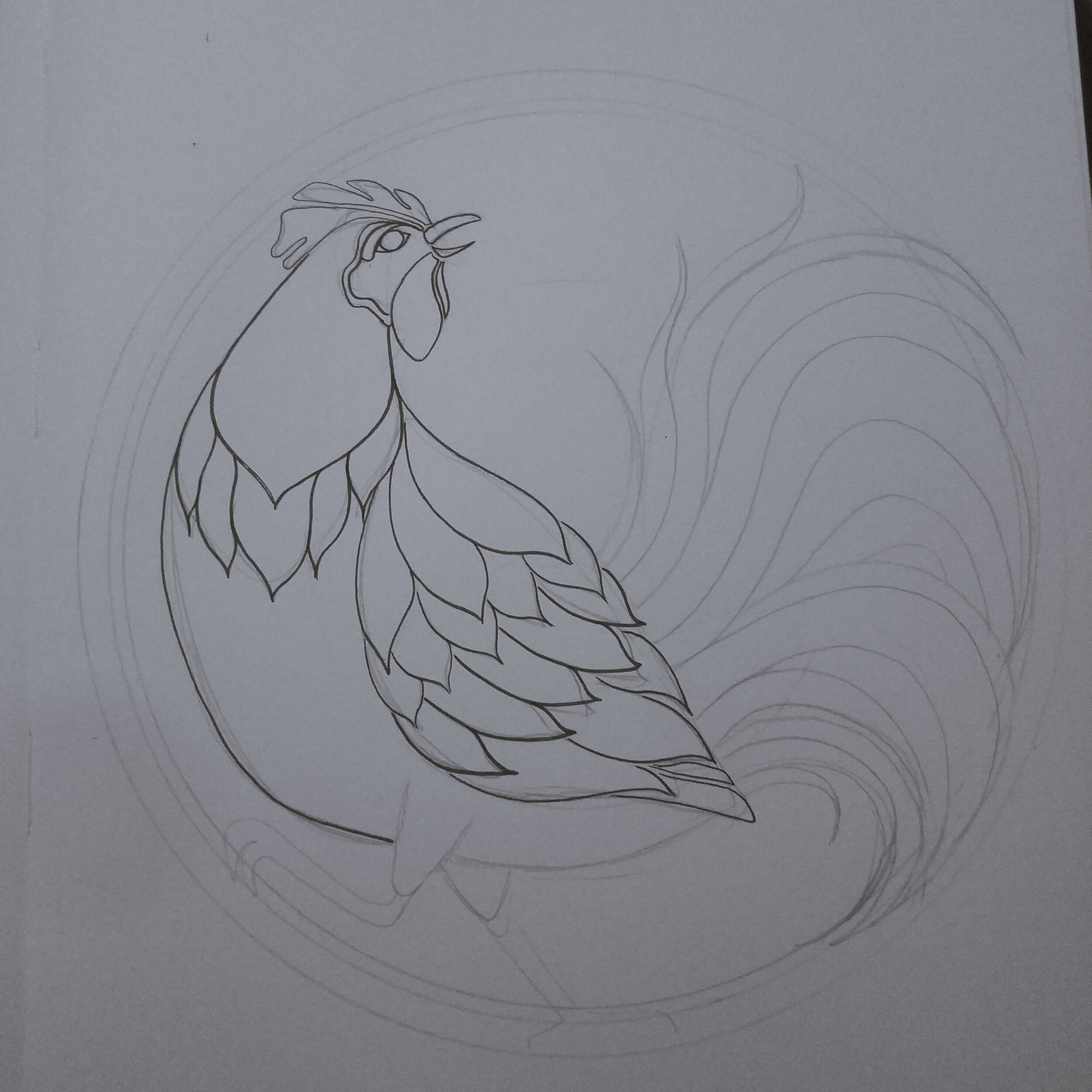
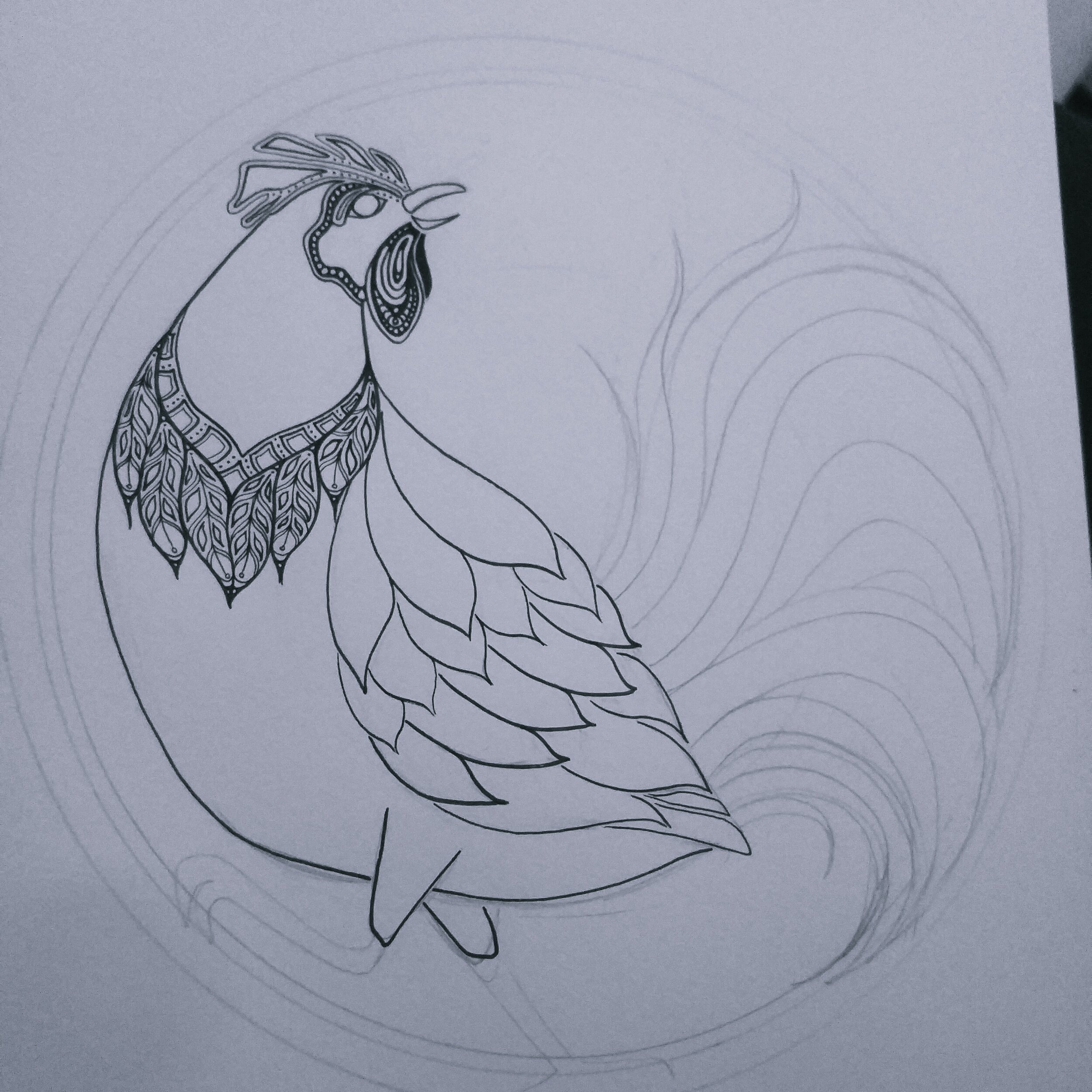
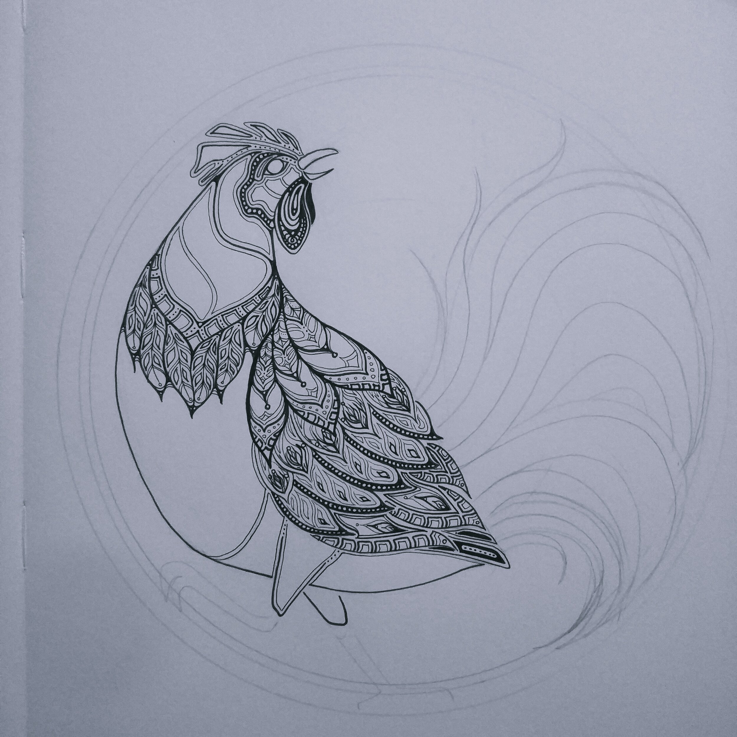
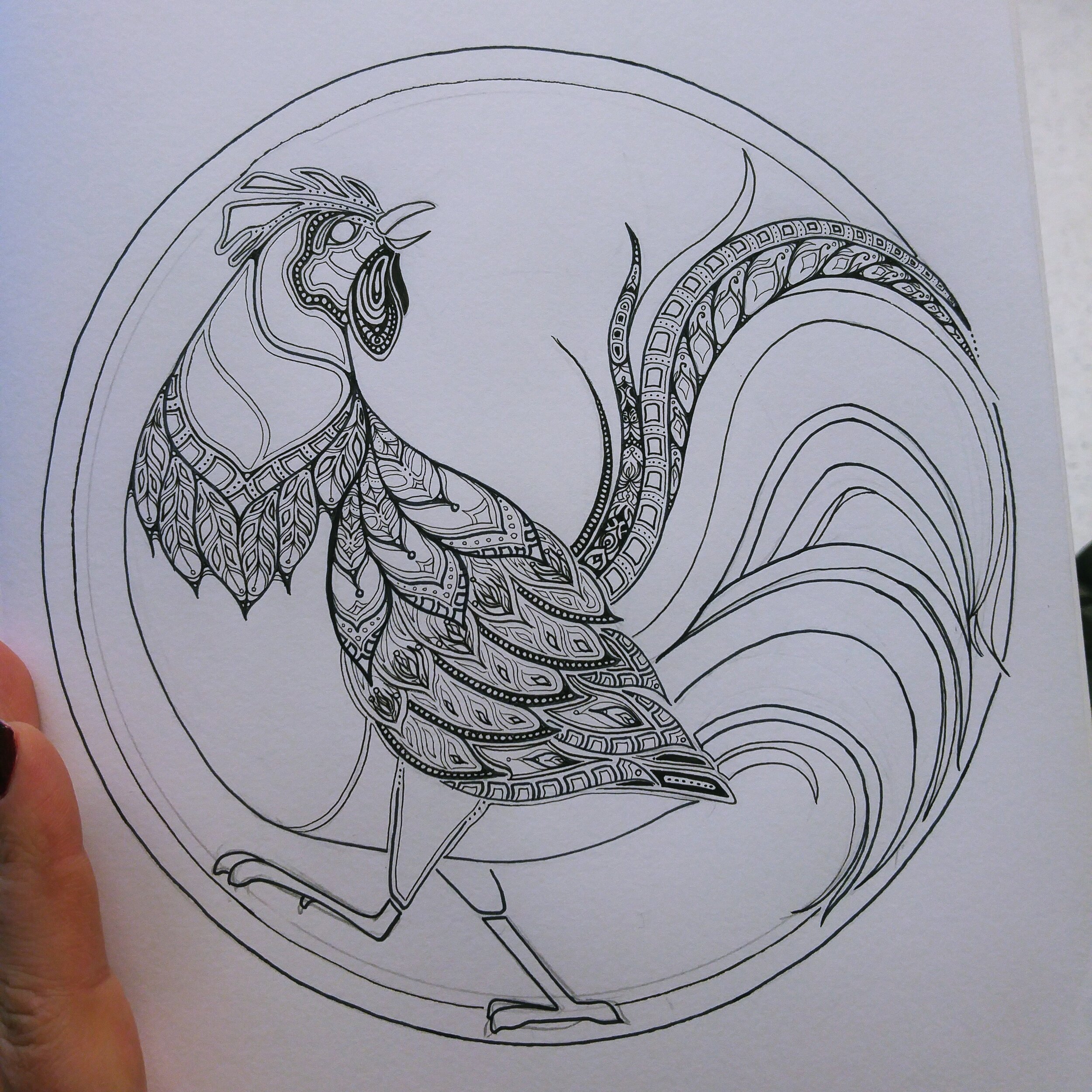
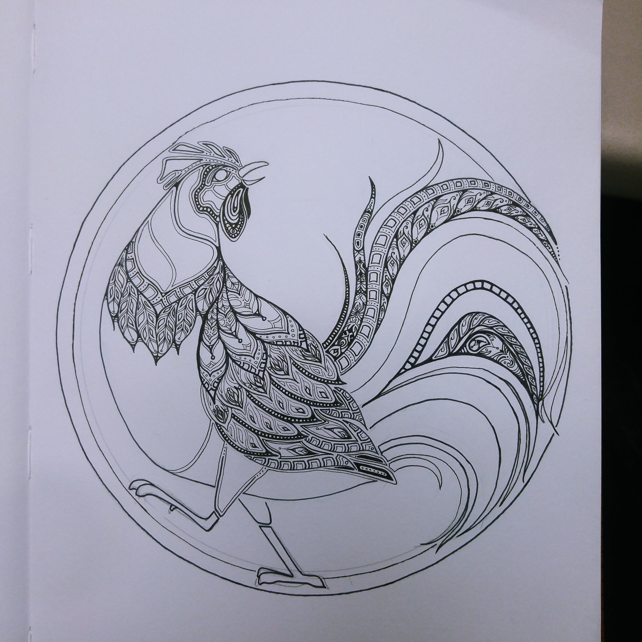
It began like many, with a pencil outline. I slowly worked out a lot of the shapes and heavier lines with a thicker Sakura Micron, and then went in for finer details. I was quite wary of losing track of the pieces within the tail here, so kept a lot of variation within it to keep it clear.
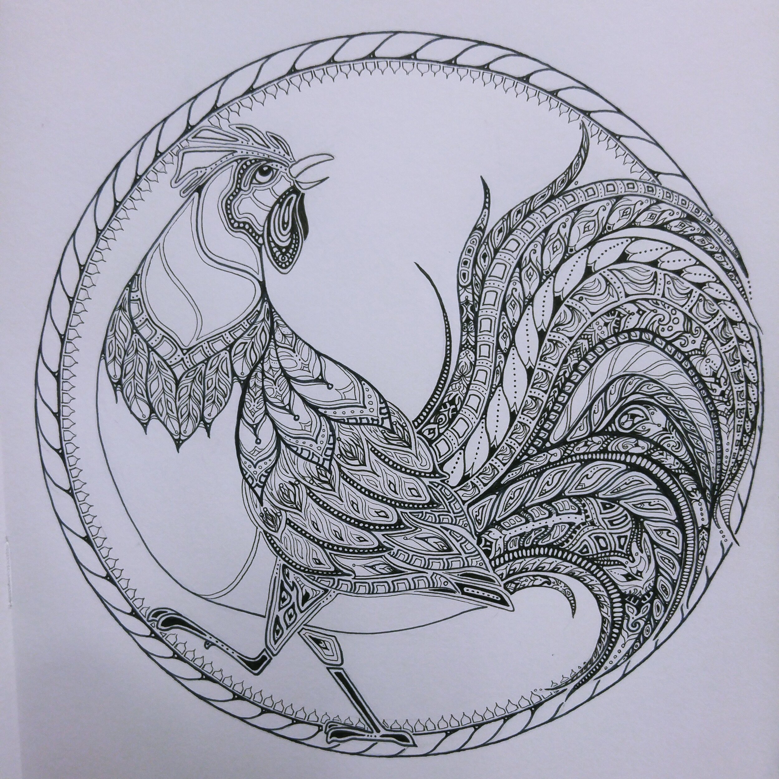

This piece remained black and white for a long time. I believe I had just moved back to Prince Edward Island when I began colouring it, so it’s certainly one that travelled with me and took some time to mull over the colours with. I’m not a natural with colour, and I distinctly recall using Jim Krause’s Color Index XL, which I still use all the time. It is just a lovely reference guide that I would recommend to anyone.
The final piece ended up with lots of burnt orange, red, browns, blues and little tiny hints of purple and a deep yellow. There’s one auburn colour in there I love that is always the closest I can get to PEI clay. I know it seems cliche but it really is one of my favourite tones. I’m wearing it as I write this, I kid you not.
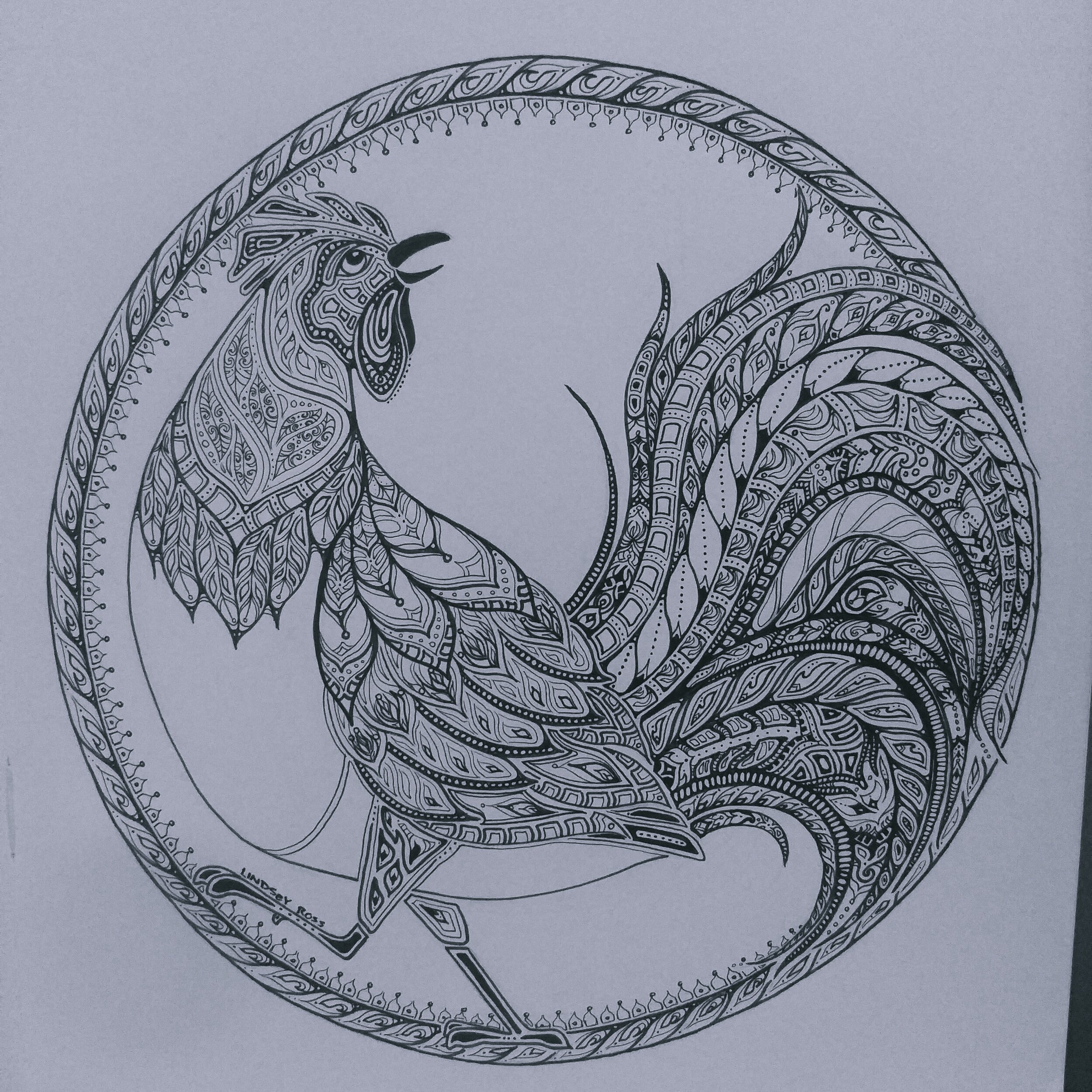
Colouring this piece really made the tail patterns pop, I had worked really hard to not have them blend to the eye, and colouring it made them all the more crisp.
The original size of this rooster was just over 8” x 10”, so I think that’s how he looks best! I sell him mostly in the 8” x 10” prints, and as a blank greeting card on Etsy.